No Expensive UK Housing Market Builds Lots Of Housing
But There's Only One Expensive UK Housing Market
YIMBY Twitter has been sharing a graph that plots housing development against price in various US cities:
Imposed over the graph is a grid, breaking the data into four groups:
The top-left, cities that are expensive and build relatively little
The bottom-left, cities that are cheap and build relatively little
The bottom-right, cities that are cheap and build lots
The top-right, cities that are expensive and build lots
Check the top-right: it’s empty. YIMBY Twitter likes this graph, because it demonstrates a core corollary of the YIMBY position: no expensive housing market also builds much housing.
Of course, this doesn’t constitute proof of the point in either direction: cities could still be expensive despite building lots if they simply don’t build enough. If demand keeps outstripping supply, things get more expensive. Lots of popular, housing-constrained cities have been both popular and housing-constrained for a long while, and this produces a backlog of demand from which new supply can draw.
And nor is it the case that building lots is necessarily the reason why places are cheap. There are, indeed, examples of cheap places that both build (like Vegas) and don’t build (like Detroit).
But it does suggest that building lots is at least a necessary condition for affordability, and, for the most part, that’s the ball game.
I spent Saturday afternoon playing with the UK data:1
And we see the same general phenomenon: no area that builds a lot is expensive. We even see the same pattern when we use a log axis to help us ‘uncluster’ the individual points:
I’m using slightly different datasets, with slightly different definitions, from the original US example.2 The choice of these datasets was much more governed by how easy it was for me to find on a Saturday afternoon, and not by their statistical quality. This is, as should be clear, an inexact piece of science.
But the core logic looks the same: no expensive UK housing market builds lots of housing. Only 19.7% of the local authorities that build more than the median are in the top quartile of prices.
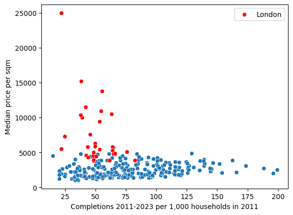
The funny thing is, though, this effect is only visible in London. Here is the original plot, with London in red:
There is a horizontal line drawn at around £5,000/m^2 indicates a ‘ceiling’ effect where no authorities outside of London reach the price levels seen in most of the capital, regardless of their completion rates. (In fact, the only non-London borough to exceed this £5,000 mark is Elmbridge, which sits within the M25.)
If we isolate London entirely, we see something a lot clearer:
This negative correlation between price and completions in London is strong: -0.429, with a p-value of 0.016. So it’s both strong and statistically significant. There’s also quite a lot of internal variation here. Kensington and Chelsea is five times more expensive per square metre than Kingston upon Thames, despite the fact they have similar build rates. And Barking and Dagenham build four times more than Kingston!
But in the context of the rest of the UK, even the stalwarts of Barking and Dagenham are only at the 65th percentile of builders, and the average London is at just under the 30th percentile – 70% of UK authorities build more.
The lesson for London seems pretty clear: build more, and the price should come down. London is experiencing such extreme demand pressures that building more might not always depress nominal prices, but there’s good evidence here to suggest that where boroughs do build more, prices are lower.
Outside of London, though, it’s a different story. Here’s the same graph but with London removed:
The effect is much less visible. In fact, the correlation is slightly positive: areas that build more have higher median prices. Which… makes sense? In a typical model of a market, higher prices would induce greater supply. And while UK housing supply is inelastic, it’s not completely inelastic: people do want to build in more expensive areas.
We we look at the South East, we also see a weakly positive correlation between house prices and completions:
If we restrict the authorities to those within 50 miles of Charing Cross, we can see the negative correlation much more clearly:
But this is obviously because London is throwing it off:
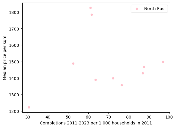
When we go further afield, up to the North East, we see that both the average number of completions is much higher, the price is much lower, and the correlation is strongly positive:
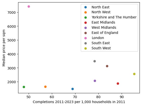
There are few places, in fact, that build less than London, and no region that costs more:
But we do again see this weak positive correlation between build rates and median price between the regions, too: the South East and East of England have built twice as much over the past decade, and their prices are upward of double those of Yorkshire and The Humber.
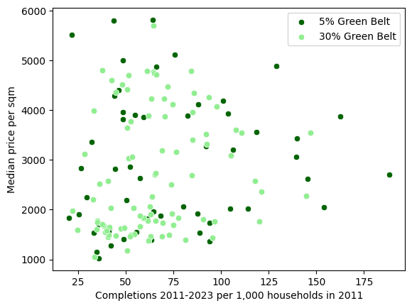
Local authorities do differ quite widely: some are rural, others are mostly urban and suburban. One important variable is whether there is a significant amount of ‘Green Belt’, a type of planning designation intended to prevent urban sprawl. But we can see that even the presence of significant amounts of Green Belt land in an authority doesn’t change the pattern very much:
There is a general clustering to the left of the graph, which makes sense, considering that Green Belt is designed to restrict development. When we take the averages of local authorities with at least 30% green belt coverage and those without, there is an important difference:
Non-greenbelt land builds more but also has a higher-price - although, again, London is confusing things (most of London isn’t Green Belt). When we remove London from the comparison, we do see local authorities with at least 30% Green Belt coverage build less and cost more:
But none of these comparisons are really that informative. Areas with large amounts of Green Belt have, almost definitionally, higher demand. And the scale matters: sat against the rest of the rest of the country, the difference seems much less significant:
So, what lessons should we learn from all of this?
First, that the UK housing crisis really is a London problem. There is extreme price disparity between London and everywhere else, including the South East, and London builds much less than the rest of the UK, including the South East, and even very near London but not quite in London (50 miles from Charing Cross gets you to Oxford). There’s a clear ‘ceiling’ at around £5,000/m² that only London boroughs (and one nearby area) exceed. There are unique supply and price dynamics within London, too, showing a strong negative correlation between construction rates and prices.
Second, that there is a positive relationship between price and completions everywhere except London – and this is rather interesting. It of course does not invalidate the basic YIMBY claim, but it does suggest that there are more complex reasons why prices are high. Even in the traditionally expensive and more dense South East, we don’t see a meaningful difference in prices between areas that build more and areas that build less. Why this is isn’t clear to me; I’ll have a think and post again when I’ve figured it out.
Third, that the US and UK patterns seem similar. There is a cluster of ‘superstar cities’ in the coastal US – that build little and have high prices – as well as a few highly productive cities in the sunbelt that build a lot of houses and keep prices low. In the UK, we have one superstar city, and some significant variation between the others in terms of build rates. A few places stand out as doing a good job delivering even with high demand: Cambridge and Winchester have both had roughly 140 completions per 1,000 households in 2011.
But, fourth, there is still a significant difference in absolute cost. Las Vegas sells its homes for somewhere near £850/m²; this is nearly six times cheaper than Cambridge. There are many places in the US where prices are significantly lower: the superstar cities begin around $200/sqft, which is ~£1,660/m², putting eg Boston comfortably in the cheapest quartile of UK cities.
Overall, this suggests to me that the UK YIMBY project should double-down on London, since focussing on London is where the highest returns are likely to be. The New Towns programme might be an easier political project to justify, but it seems substantially less effective at bringing down costs.
Thanks to Benedict Springbett, Ben Dunn-Flores, Jessica Rumbelow and Henry Dashwood for support and comments.
If you’re interested in seeing the data and code, you can find it on Github.
For floor space data I’m using a dataset from the Valuation Office Agency, which gives us the average square metre per local authority. We pull population-level household data per local authority from the 2011 Census; note this is households, not dwellings as in the US example. The median house prices for administrative geographies dataset from the ONS gives us the prices paid for different household types; we aggregate them for simplicity, obscuring the differences between apartments and detached houses. And, finally, for the build-out rates we draw from the House building, UK: permanent dwellings started and completed by local authority dataset, also from the ONS.


Just wondering if you've deliberately used the New Build figures rather than the Net Additional Dwellings dataset? I only just noticed this difference on your post with every single Authority having their own chart, Brighton and Hove comes out the worst, with only 14.8 completions per 1000 existing households.
Brighton does have a bad building record, but not *that* bad - its Net Additional Dwellings are 4,904 over the decade, against a starting point of around 125k households - so that's more like 39.2 additional dwellings per 1000, so it's a difference of 2.5x or so compared to the data set you're using.
I asked Perplexity to explain the difference between the two sets, it told me:
New Build Completions counts only new house building starts and completions
Net Additional Dwellings measures net change in total housing stock, which includes:
- New build completions
- Conversions (e.g., turning a house into flats)
- Change of use (e.g., office to residential)
- Demolitions (subtracted from the total)
I suspect this probably skews the conclusions a bit - I would guess that the most constrained places are more likely to get dwellings from conversions/change of use than from new builds, so it might change the shape of the chart somewhat. I wonder if the comparison to the US is also changed: I don't know if the US figures you used would include conversions etc.
Net Additional Dwellings can be found here: https://www.gov.uk/government/collections/net-supply-of-housing
Hi! Great work, really interesting topic and read.
I wondered, is there a link if private enterprises are involved in the building that they are choosing to build in places where they are able to sell at a good price relative to those areas?
For example, in Manchester I would be surprised if lots of housing was built in a lesser economically developed neighbourhood as the margins wouldn't be there? Whereas in wealthier areas in the south east, I would expect there are more reasons to come in with a small burst of additional supply and be able to sell at the same rate as other older houses