Responses to No Expensive UK Housing Market Builds Very Much Housing
And some more fun graphs
Last week, I wrote a post about the relationship between housing cost and completed dwellings. I also posted a Twitter thread, which ended up more widely read than my usual nattering. I enjoyed my fifteen minutes, and quite a few people responded with thoughtful analyses and fun questions, so I thought it’d be good to consider some of the responses in more detail.
US vs UK
Most significant was the quick observation from @IronEconomist that my graph, which plots the UK data:
and the original graph, which plots some US data:
were using different X-axes:
Is the x axis here total completions per 1000 households over a decade? Whereas the US one is annual completions?
This wasn’t something I had noticed before. When I was compiling the original dataframes my attention was on the ‘per 1,000 units in 1990’ bit, not the ‘annual’ bit. But, of course, he’s right: the UK graph is using the sum of completions across the relevant time period and the US graph is using the annual average.
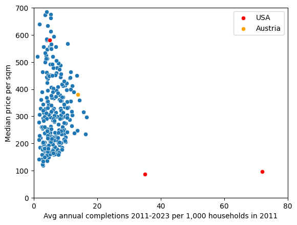
When we recalculate the UK numbers to use annual averages, and plot three of the US results, we get an even more horrifying picture of UK construction shortages:
The three US data points are, from left to right:
San Francisco (price = 5000, completions = 5)
Atlanta (price = 740, completions = 35)
Las Vegas (price = 830, completions = 72).
I took those numbers by eyeballing the US graph, and doing the conversions from $ to £ and from square feet to square metres, so there’s good reason to doubt them. These numbers also represent different ranges: the US data is from 1990-2013, whereas the UK data are from 2011-2023.
But if they are even vaguely, directionally correct, we should be shocked: of our three cities, the only one clustering with the UK cities is San Francisco. If we try to make the axes match, almost every UK city ends up in the top-left quadrant:
And if we impose (roughly) the same boxes as the original? Oof.
It’s not just the US that builds well, either. Here’s Austria, that great darling of YIMBYism both left and right:
Less shocking, but still pretty impressive - it is slightly higher wrt costs and toward the top range of UK build rates.
Austria have some decent stats on completions, and, helpfully, they also had a census in 2011. There’s a lot of social housing in Austria, and there are lower rates of private ownership, so I’m not sure how reliable this number is: but here’s where I got the price from.
And then I remembered that the UK has seven times the population to Austria, so, scaling up:
I had to change the axes to fit it in. I know this is cheating a little, but still: good job, Austria.
The lesson of all of this: the UK builds very, very, very little. Even under conservative assumptions. Even with lots of caveats. Even if you’re sceptical. We are not even remotely in the direction of beginning to catch up with other places.
Land vs Houses
Some readers, such as John Stepek and Vicky Spratt, interpreted these results as a counterpoint to the YIMBY claim. And there’s a sense in which they are right: it does complicate the analysis.
The basic YIMBY take is something like a combination of the following three claims:
The housing market is a market like any other, following laws of supply and demand
The planning system restricts the supply of land more than it needs to
Building more houses will reduce those prices
Based on the data here, this basic take seems essentially true in London, although if you really wanted to challenge it you could gesture towards eg high levels of pre-existing development in certain London boroughs (which would push against 2; ie the planning system as the cause of restricted supply). Even that, though, is hard to defend, when you consider that London is much less dense than it could be.
You might also push against (3) if you think that there is a cycle of productivity growth to be gained by building more houses. More houses increases agglomeration effects, which drives productivity higher. Some of the surplus created by higher productivity is captured by workers, who gain a wage premium for being there. Higher-paid workers are willing to pay higher nominal amounts for rent and homes; this drives up prices, inducing more supply.
And this also seems the case, but we’d only expect to see prices go up relative to wages if supply was constrained, and it is, and we do. So the problem is not so much that ‘London is successful therefore land is expensive’, as John and Vicky argue: it’s that London doesn’t build enough relative to demand growth that real-terms increases are inevitable. But that is a reversible thing without having to meddle with demand: build more.
They also get something more fundamental wrong, which is an easy win for the YIMBY: ‘land’, in this instance, doesn’t mean soil, it means developable area. You can gain more land by building up, as well as out. And the British planning system is, for a mixture of reasons, perversely set against building higher than a few stories anywhere other than the dead centre of the city. So we can easily gain more space for supply to grow if we are willing to densify zones 2-5.
Outside of London, though, the story seems a bit different, and it wasn’t clear to me at first blush why that would be the case. There are places outside of London where the market seems less dysfunctional than it does inside the M25: places where an increase in prices is met with an increase in supply. In these areas, there are a range of completion rates and a range of prices, and a weak but positive correlation between completion and price. In some of these places housing is more affordable than others, and a lot of this difference is almost certainly accounted for by differences in variables other than mere supply: total amount of available land, local demand pressures, the effects of build rates in other neighbouring housing markets, etc.
These thoughts combine to give us a highly plausible explanation for why we see this negative correlation in London and nowhere else:
The planning system works against the sort of development that London needs, so it restricts supply. And London is so extreme, so obtusely, so effervescently undersupplied, and has been for such a long time, that it has hit a form of inefficiency frontier: it will take a lot more supply to flip the correlation round and start seeing decreases in prices in nominal terms. But that doesn’t mean that there aren’t margins where building more will reduce prices, nor does it mean that we cannot stem the bleeding. Building more homes won’t decrease prices in London overnight, but it will make things cheaper relative to the counterfactual where we don’t.
And as for the rest of England? The market works more like we would expect it to. But this is also not a reason to celebrate, and it doesn’t mean the market is effective. Compared to many, many countries in the world we pay much higher prices and get much less living space for it. Until proven otherwise, the assumption should be that this is caused by the planning system, since it is the planning system that sets the rules, grants the permissions, sets the strategies and and doles out the punishments. Reforming that system to get more houses built should demonstrate – all else equal, of course – lower prices. And, once again, the the burden of proof is on the person who doesn’t accept the laws of supply and demand to make the case for why it is any different.
Variations on a theme
Some of the other responses had the rough outline of: “interesting! Let’s see it with THIS variation!” I picked a few of my favourites and produced the same graphs.
Duncan Stott asked:
Very interesting. What happens if the y-axis is affordability (i.e. divide by local average incomes)?
Good question, Duncan. Let’s pull the ONS data on earnings by local authority, reformat it a little, and divide median price per sqm by median salary in that local authority:
Same result, only this time it’s more worrying: not only is London expensive, it’s also unaffordable.
Matt suggested change in price rather than absolute price:
Thanks, that’s really interesting. One suggestion: I feel think change in price would be a better metric than absolute price? In other words what impact has building had on price. Appreciate you were comparing to the US analysis in the first instance!
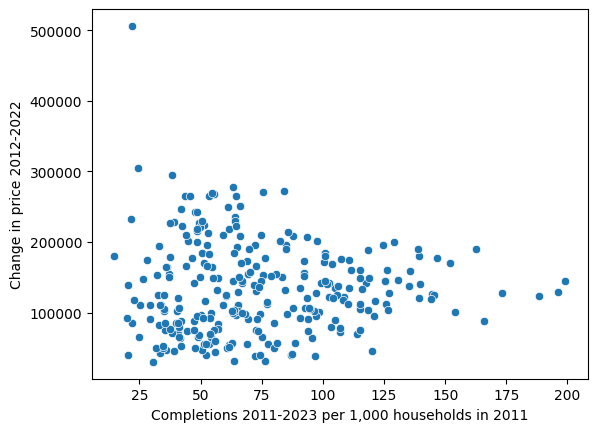
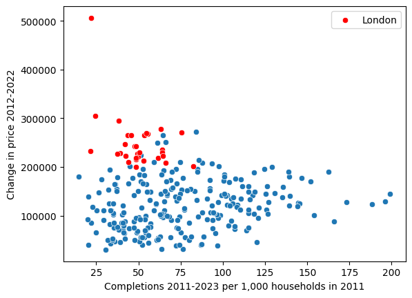
Sure! We’ve got the price data for 2012-2022 already, which is close enough. Let’s plot that on the Y-axis instead:
And with a log scale:
The non-London ceiling still appears, which is interesting, and London is clearly still bunched up at the top left (which means both high changes in price and low completions):
Rory Evans wanted an interactive version. I didn’t have the time to make one truly interactive, but I was able to generate a graph for every single authority. They’re sorted by descending price, and each graph has the name printed above, so you can Cmd + F and find the place you’re looking for:
Just Another Dan suggested that we see how the x-axis looks with respect to demand. Both change in price and median wages seem like reasonable, albeit very noisy, proxies for demand, so I’ll go ahead and give you median price by completions over change in price:
And median price by completions over median annual wages:
These graphs are interesting, in part because of the more visible hyperbolic shape. There’s a more obvious inverse relationship between price and completions over change in price, and this graph shape is what you would expect to see in cases of inverse relationships (compare, eg, Boyle’s law in physics.)
What this tells us about the housing market is that local authorities with a higher completion to ‘demand’ ratio have both lower, and, it seems, much more stable prices. This is important, because the x-axis can be interpreted as a measure of how responsive housing supply is to price signals. The fact that we see these high levels of volatility when this responsiveness is low suggests that there areas which build less are more susceptible to local demand-side factors. Or, running it the other way, areas which build more can absorb changes in demand more effectively. This is (yet another) instance of the housing market behaving, well, the same as most other markets. Demand goes up, and prices will chase it – unless supply can expand to catch them.
Finally, Baron Douro taught me the word heteroskedasticity, which, apparently, means that I should use more log scales.


